Siva Travel
The Brief
All successful businesses have one thing in common: They evolve.
And, as such, it was time for such an evolution for Siva Travel. Previously trading under “Cheapairtickets”, they wanted to take that next step in their brand evolution and rebrand under “Siva Travel”.
The plan was to re-establish their entire online storefront. This meant a brand-new bespoke website AND booking engine platform. To which we were more than happy to assist with.
The Opportunities
Any evolution of anything provides a unique opportunity of perspective. It gives you the chance to take a step back and look at what works for your business (and what doesn’t), and then look to improve upon those aspects for future iterations of your brand.
Furthermore, being the designers of their previous website and booking engine, it gave us an equal opportunity to improve upon what came before. Bring new ideas to the table, utilise new technologies and ultimately show our own evolution as web designers in this next step of evolution for Siva Travel.
And it’s here where the project could truly take off in a new direction.
Having most recently undertaken a similar project, where we developed a bespoke booking engine for a client based in Norway, we decided we could take what we’d learnt during that process to create something worthy of Siva Travels’ brand growth.
The Solution
Siva Travel’s primary focus is selling flights. Therefore, we decided to start this project at the place that would matter most to customers: the booking process.
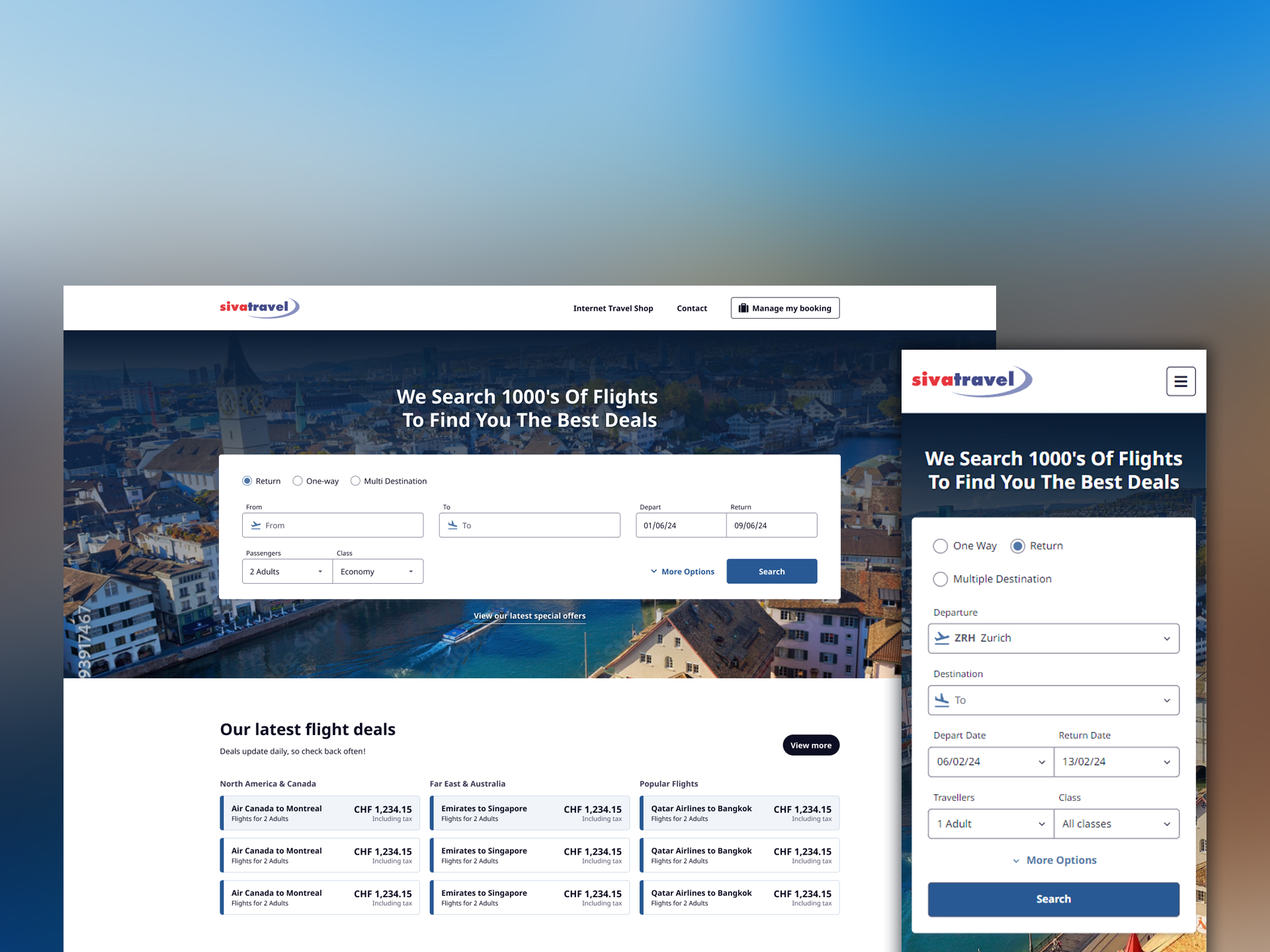
By starting at the booking engine, this allowed us to focus on curating a flights-focussed experience and perfectly structure and display the information on show to customers.
Results cards were designed to show the most important information first with quick access to book the flights for you; flights based on a series of custom filters crafted for all types of travellers.
The rest of the booking process was equally crafted. Giving unique attention to flight upgrades, seat maps, and even form structure. We designed the entire booking process to be as clear and concise as possible.
But the structure of a booking engine means nothing if we don’t wrap it in a design that brings attention to the right information.
Our design system had one goal. To be simple. Introducing additional fonts, colours, styles, means nothing if you can’t use them in your design effectively.
We stuck to one font family, versatile enough to provide us with a variety of font weights to build visual hierarchy easily. We stuck to one primary colour. The human eye is immediately drawn to anything that stands out, which we used to our advantage throughout the booking engine and colour elements that will be useful to the user.
We also stuck to one set of rules – if information or elements are presented in a particular way, they inherit particular styles, always. This helped reinforce a design system that brought cohesion to the entire project.
With all the design elements already crafted for the booking engine, creating the website became a walk in the park.
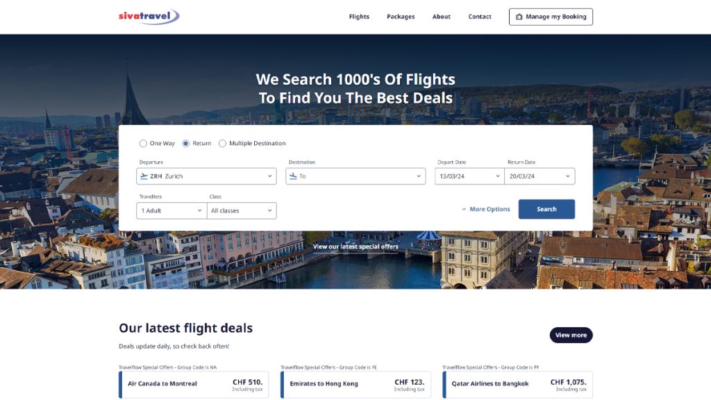
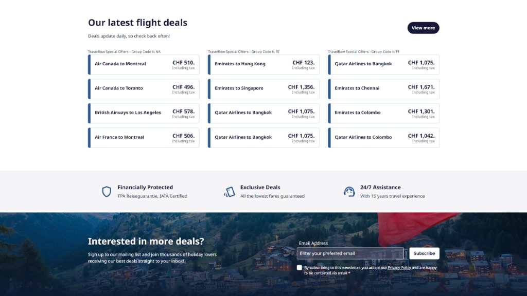
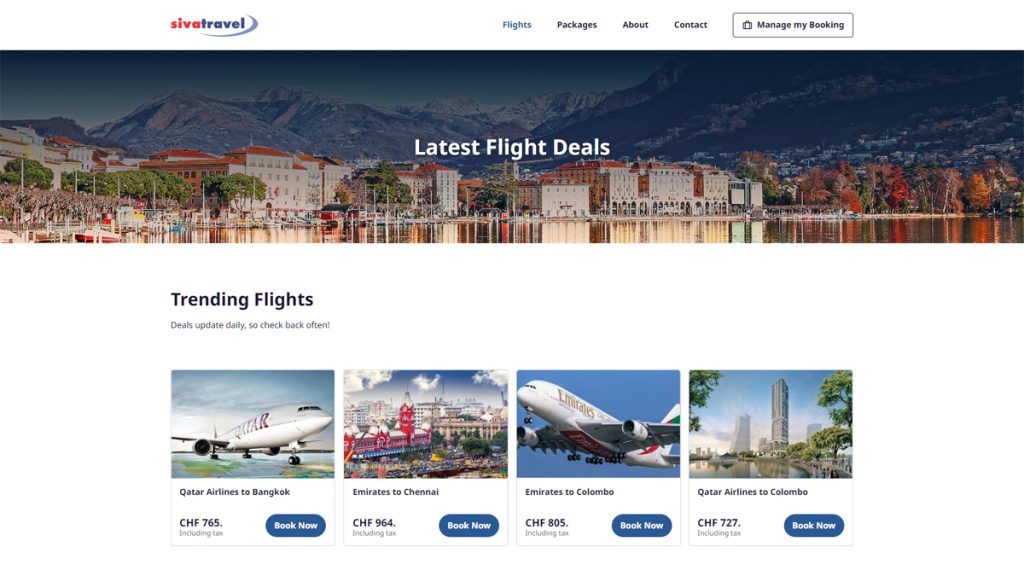
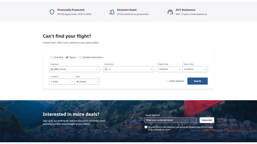
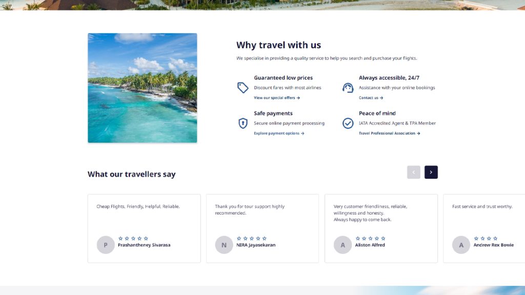
We redesigned the existing website with our new design system to bring the same content inline with our newly designed booking engine – elements and information could be displayed in the same way, from buttons to accordions, heading hierarchies to icon styles, it all combined perfectly.
Both website and booking engine could come together beautifully in a design where neither element looked out-of-place next to the other.
The Result
The finished project was something that not only the client loved, but we were insanely proud of too.
By reapproaching this entire project from a different angle meant it could come together to form one complete package – both website and booking engine worked together seamlessly and looked like they belonged.
A new website meant we could ‘trim the fat’ of the previous, make it look more professional, structure its’ content more cleanly, and build it using better techniques to bring it to the forefront of modern web design.
A new booking engine also meant the world to this project. By focussing on the individual requirements of such a project meant we could tailor a product meant for the client, their individual needs, and their main selling point – flights.
We’re so pleased to see this launched and we couldn’t be more thrilled with our teams’ efforts to pull this project off and come together to create something better. An evolution.
Check out Siva Travel for yourself and let us know what you think.
Take a look at them now
