Hogarth Holidays
The Brief
London-based Hogarth Holidays came to us looking to launch their own travel agency online, with a brand-new website and logo to match.
Their existing website and branding were in dire need of an update, to bring them up to date with modern design trends and online web techniques.
Primarily operating out of their high street branch, their new website aimed to increase their business visibility to a wider online audience and help generate more in-store bookings for tailor-made holidays and business travel to a variety of select destinations. In addition to a new website, a new logo aimed to revitalise their brand under a new modern image.
The Solution
With Hogarth Holidays looking to rebrand their business, we thought it only made sense to start from the top – let’s design some logos.
Designing a new logo is not only a fun process, but also helps set the tone for what the future website will become. For instance, a luxury logo could mean the resulting website is sharp, with crisp UI elements and serif fonts to showcase a luxury brand, whereas a slightly more fun logo can inspire rounded buttons and a vivid colour palette.
Hogarth wanted a blending of the two. A friendly, but modern typeface, accompanied with an eye catching and distinct glyph mark created a logo perfect for a growing travel agency.
Their website was to follow a similar tone.
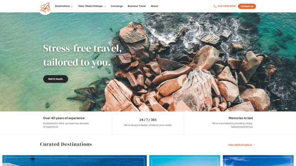
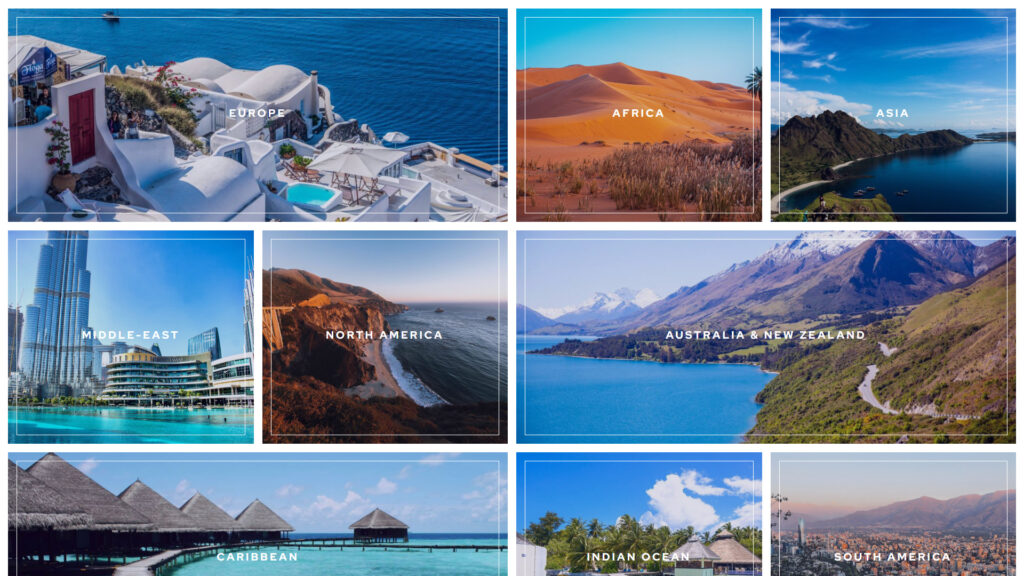
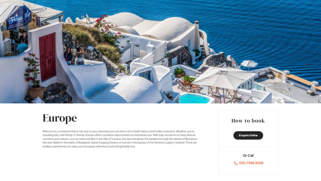
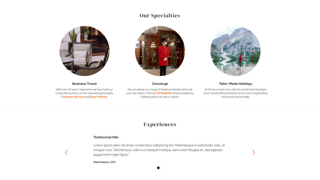
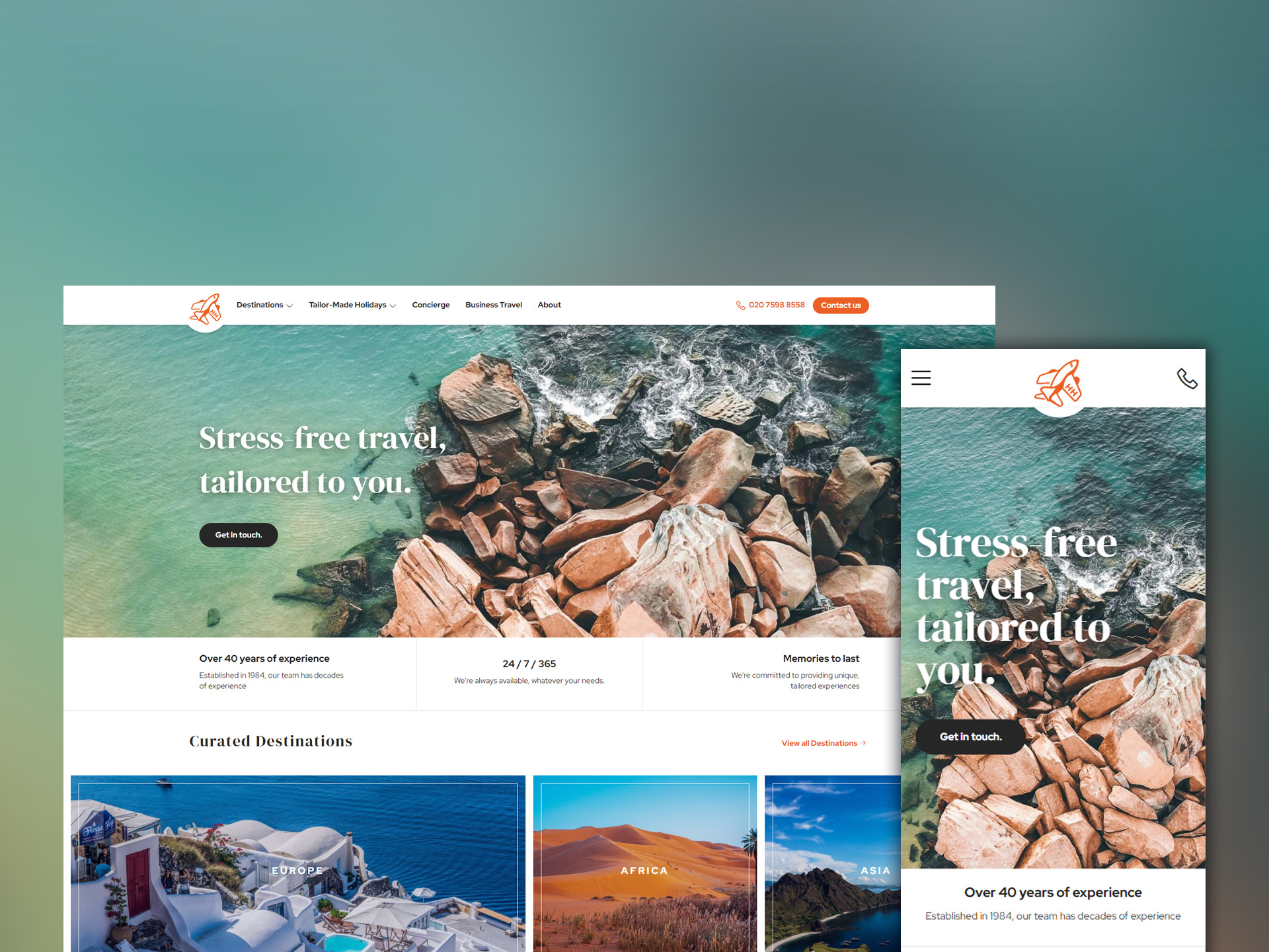
Serif-typeface headings and crisp image edges brought a level of class to the site, showcasing their experience within the industry. These coupled with sans-serif text on a variety of UI elements created a natural blend between established experience and modern, friendly tones.
All put together in a balanced, clean design, meant this website matched the tone they were after.
The Result
The resulting logo and website we had created for Hogarth Holidays made the perfect pairing we were proud to see launched.
A versatile logo that could be used in a variety of situations provided the optimal solution when rebranding a business. With or without the wordmark, the logo glyph stands out and helps reinforce Hogarth’s brand recognition.
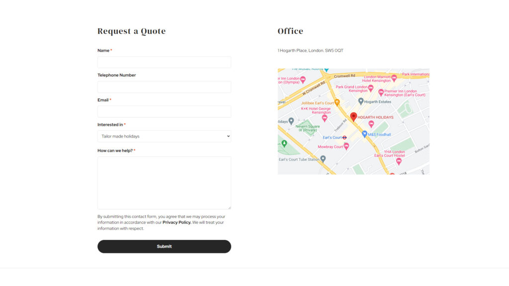
And their modern, responsive website gave them the perfect hub to advertise all their travel information in a vibrant, structured package with dedicated listings of featured destinations, tailor-made holidays and more. Should customers ever need to book their next trip, their website was the prime place to learn more and get in touch with their team in a flash.
Like ourselves, the team at Hogarth Holidays were thrilled with their new logo and website and expected many future successes operating under their new look.
Check out Hogarth Holidays for yourself and let us know what you think.
Take a look at them now
