Flywell Travel
The Brief
Based in South Africa, Flywell Travel came to us to relaunch themselves as an independent travel agent under their new branding.
Previously part of a larger consortium operating in Cape Town, Flywell Travel wanted us to give them a completely fresh website design using a fun, colourful new logo bursting with so much potential for a future brand style.
Along with a fresh travel website, they wanted to offer online bookings through our B2C booking facility as well as provide an online portal for agents to manage and sell travel to their individual sub-agent networks.
The Solution
Inspired by other popular South-African based travel providers, Flywell wanted a modern yet focussed travel website to provide a clear and concise online booking service for a variety of customers.
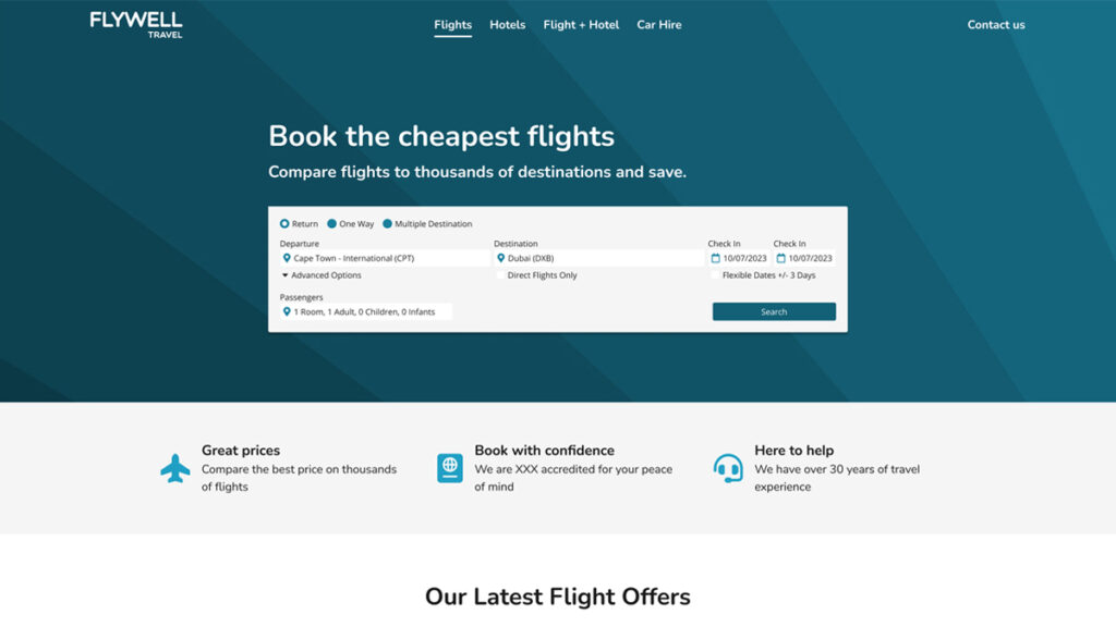
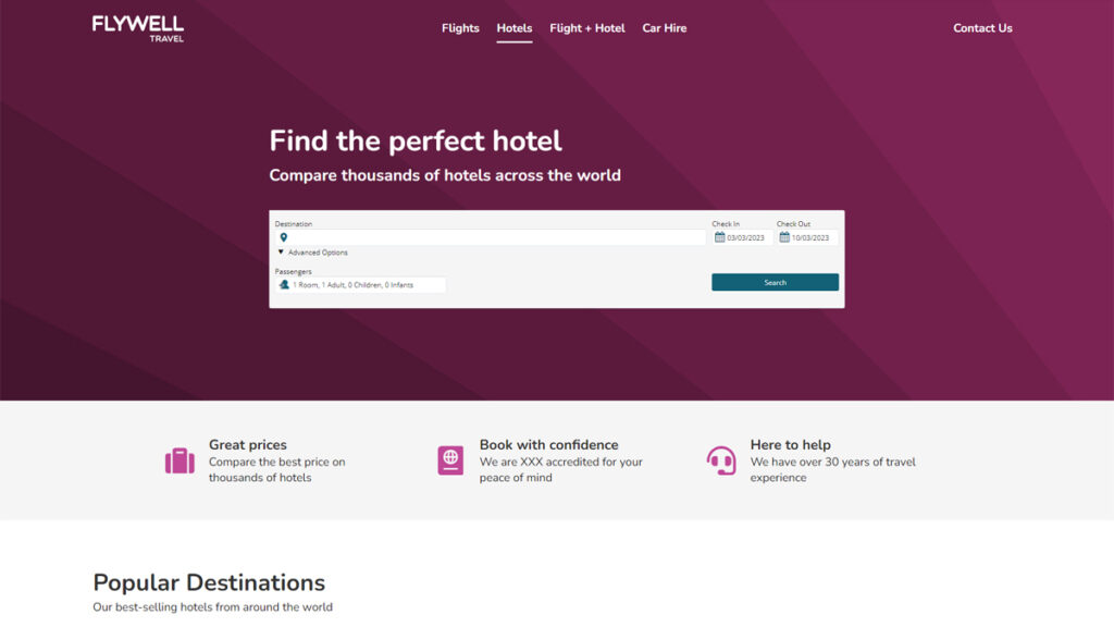
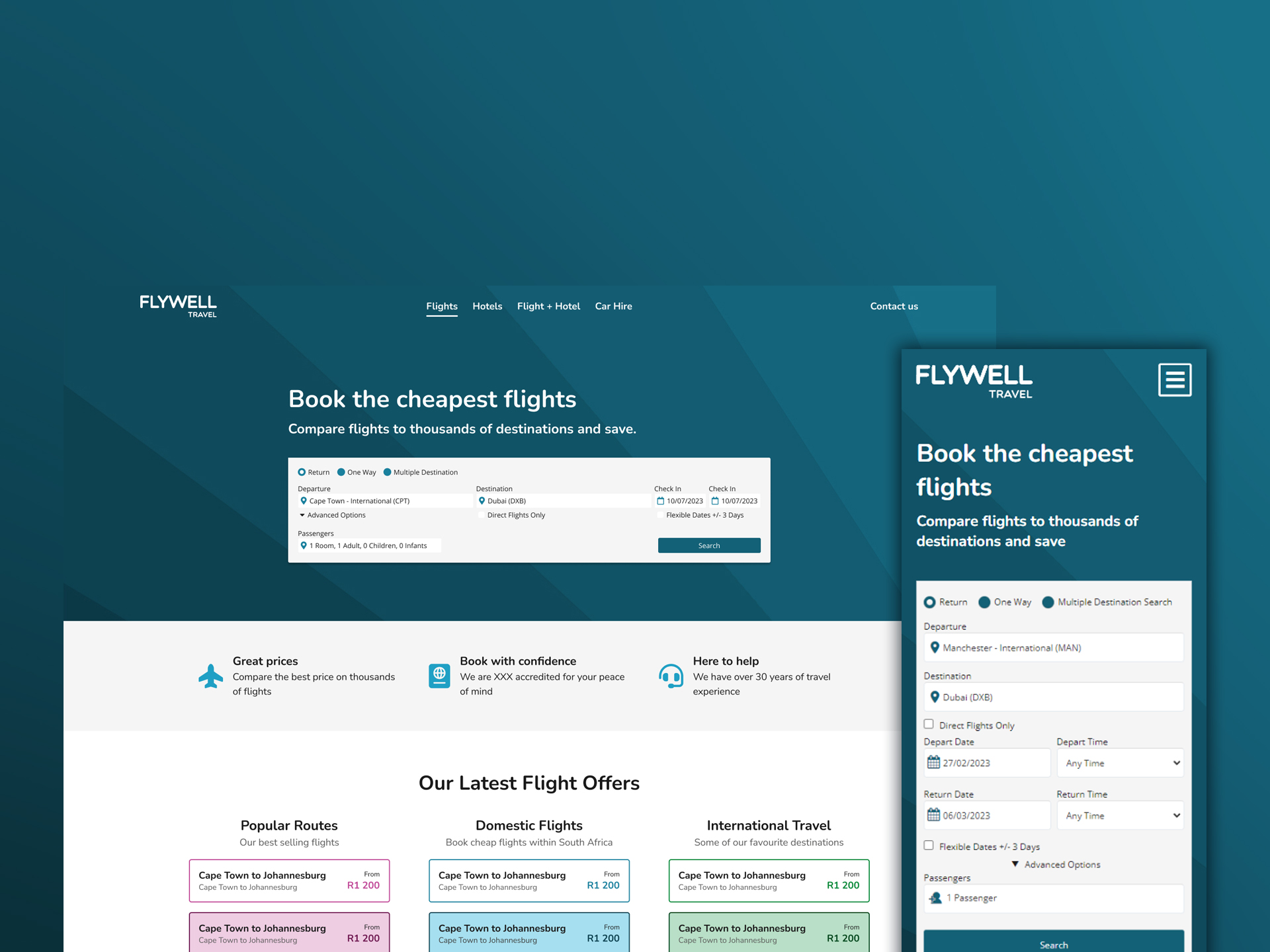
We took this inspiration and designed a website that aimed to focus on each of their travel offerings individually; a page for each travel offering allowed us to provide a more optimised content offering for the travel their website visitors would be after.
This approach paired with the new colour-palette their logo provided allowed us to create coloured themes we could assign to each transaction type. Blue for flights, Pink for hotels, And more. Each with a variety of tones that, even when based on one singular hue, created depth and distinction for the different elements and states on the page.
All that remained was to style the content that mattered most to them.
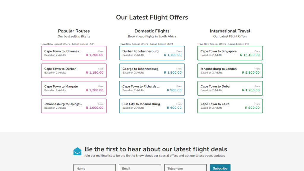
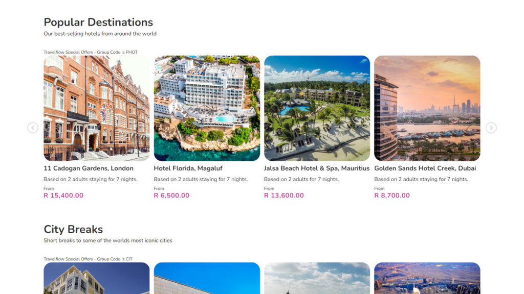
Clean and compact offer blocks for flights. Visual-focussed content cards for hotels and packages. With USPs across the board to help turn website browsers into bookers.
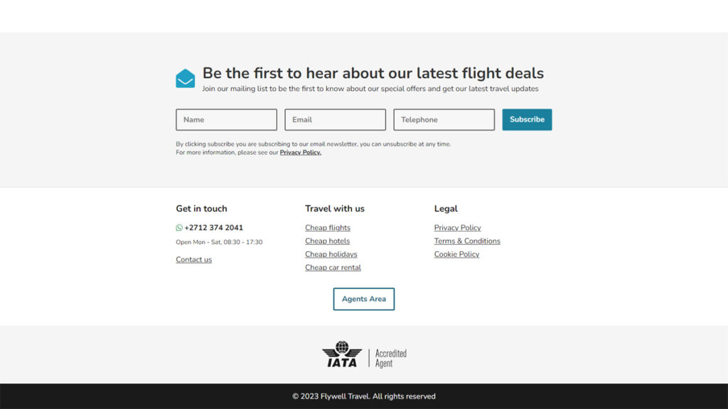
We even included a dedicated area for other agents to login and sell their fares amongst their networks, with thanks to Travelflow Trade, integrated quickly and simply into their website.
The Result
The resulting website was a modern take on what a travel website could be. Focussing less on the big header imagery and leaning more into the power of branding.
Fleshing out the individual colours of their logo and turning them into palettes of their own gave increased depth to their colour scheme.
And making use of the segmentation within their logo gave us a unique pattern element, adaptable for a variety of applications.
It’s safe to say, Flywell Travel were super pleased with how this project turned out. Seeing their new logo and subsequent branding used in this new package was more than they could’ve hoped for.
Clean. Modern. Colourful. All the things we had envisioned from this project came together in a package meant to sell travel for the modern-day traveller.
Check out Flywell Travel for yourself and let us know what you think.
Take a look at them now
