Exquisite Resorts
The Brief
An existing client of ours came to us with a vision to expand their reach into the luxury holidays market. To do that, they needed a luxury brand to be the face of this new venture. A new logo. A new website. A new challenge.
We were more than happy to accept.
The basis of this new brand would focus on offering luxury long haul holidays, tailor-made tours, golf holidays, and additional exclusives to their already existing client base of 26,000+ customers. A customer base of which comprises mainly of travellers aged 50 – 80 who appreciate holidays in higher-end destinations.
This new business hopes to meet the demand of current clients requesting for worldwide holidays alongside their business-class flights. And, by leveraging the existing success of Business Class International, along with their 5* status, they can give visitors the confidence to book.
What we did
Like all projects that aim to launch a new brand, it started at the drawing board. Logos.
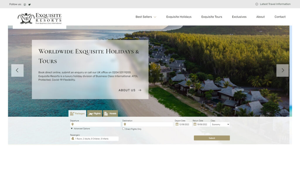
We knew this brand called for luxury. So that called for a logo that looked luxurious. The idea of luxury can be presented in a variety of ways, but to stand separate from the Business Class International brand, we opted for serif fonts and a royal colour scheme of deep greens and gold.
Now, the power of a logo is that it can really influence the design of a website. Choice of font, colour, graphical elements, you name it. All these factors can sway how the resulting design comes together. (Which is why we designed it first).
A serif typeface for titles can carry that feeling of luxury throughout its text. Pair that with a sans-serif font for body text, we created a typography system that could be applied to a variety of situations without hindering legibility.
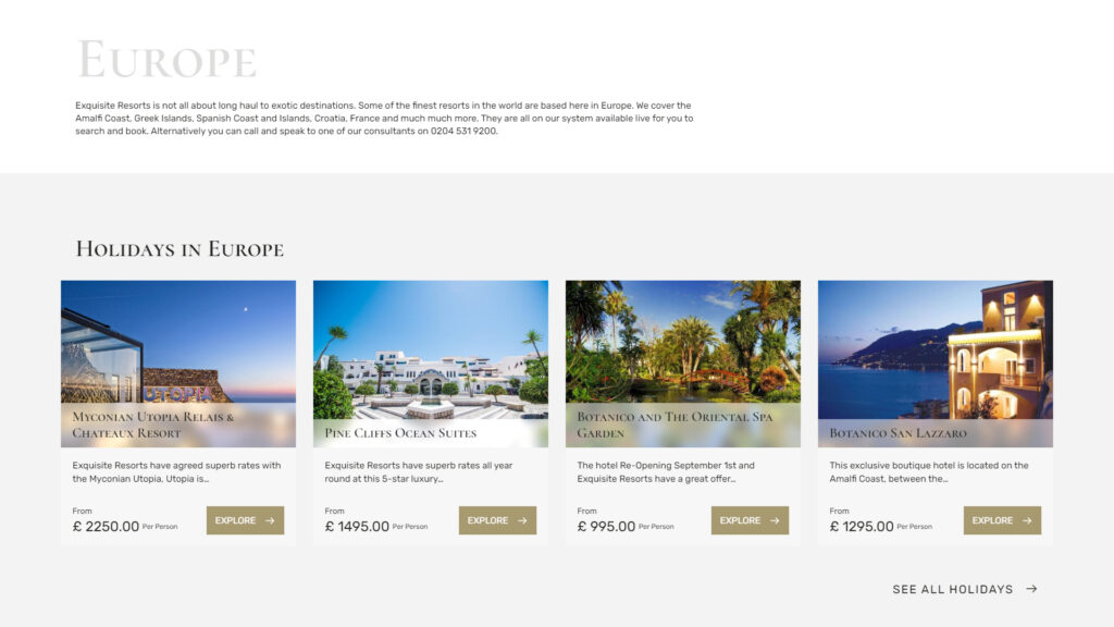
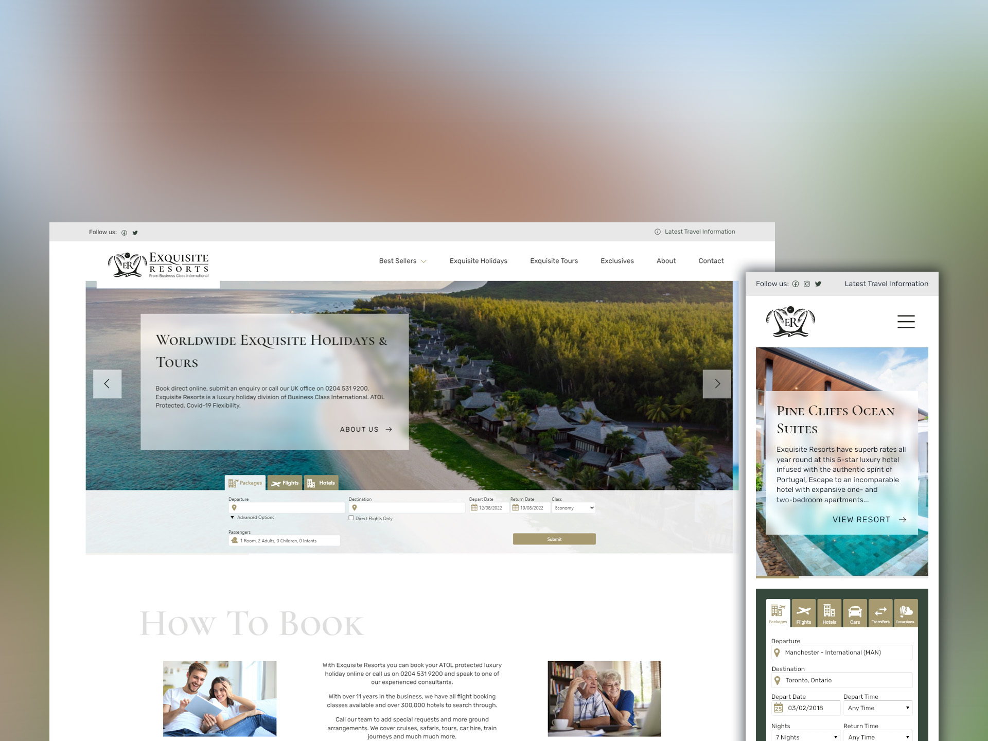
Continuing with the theme of luxury, all other elements had to look sharp. We opted for square elements like buttons and images to reinforce the crisp nature of the design. These paired excellently with a frosted glass panel element to house text on images, ensuring text remained visible, but also showed the high-class nature of the brand.
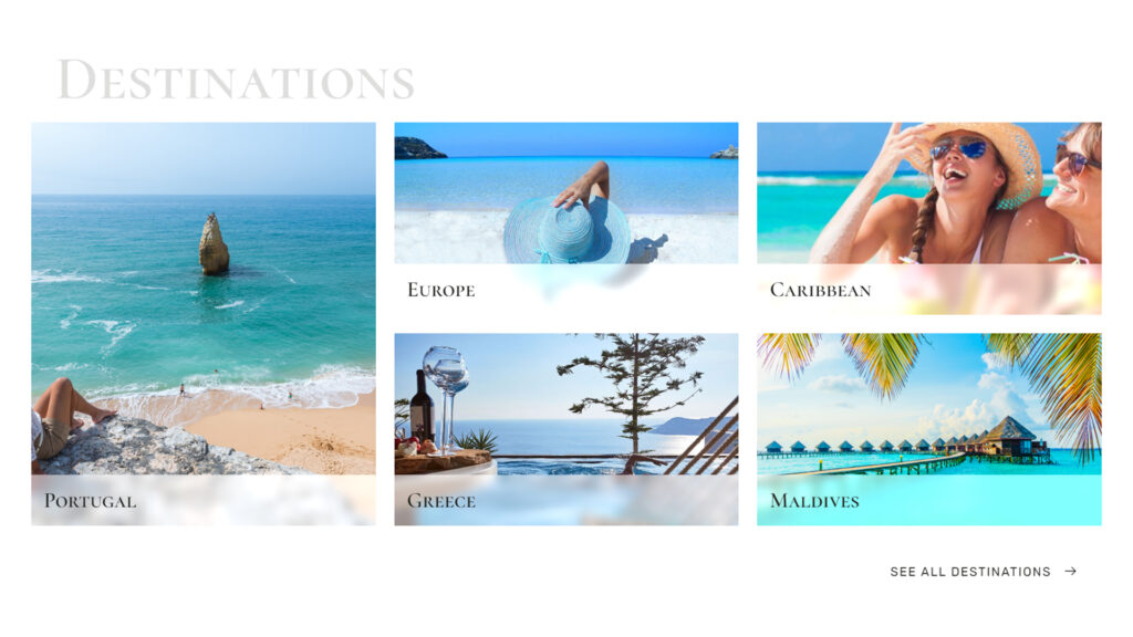
We rounded out this project with a custom content management system designed to house all the different categories of travel they planned to offer. Luxury destinations had structured pages to showcase the beauty of the location along with all available trips and holidays in the respective location.
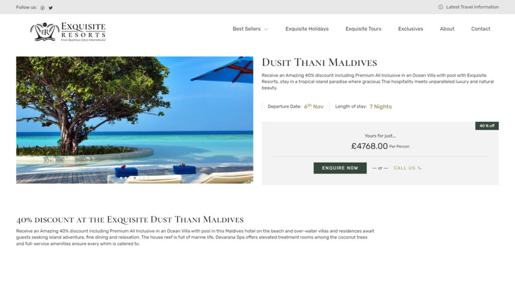
Trips and Holidays then received their own uniquely designed pages, listing available accommodation, notable features of the holiday and above all, the ability to enquire about bookings, directly from the page.
The Result
The final product of this project was a fresh luxury brand capable of standing strong amongst other luxury travel brands in the industry.
A logo consisting of two distinct elements allowed us to design a responsive website that took full advantage of this. Depending on the device you viewed the site on, visitors would be presented the full logo or just the graphical element. Both of which helped reinforce the luxury nature of the brand.
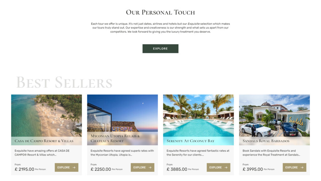
Large content cards allowed images of luxury destinations to be shown in full glory, giving visitors a taste of that destination before booking their next holiday.
And our subdued colour palette, with touches of gold and rich greens, helped reinforce the high-end nature of the brand. The content and the destinations show luxury, so that colour palette doesn’t have to.
Our client was super pleased with the logo and website we provided them. It allowed them to showcase their luxury offerings with a management system tailored to their content in a high-end design.
Check out Exquisite Resorts for yourself and let us know what you think.
Take a look at them now
