Eventservice.no
The Brief
For over 20 years, eventservice have been offering concert packages and football trips to a variety of customers, both private travellers and company groups.
Although based in Oslo, Norway, eventservice have been providing tickets and travel to many popular events in and around Europe and beyond.
As a small team of 4, they were looking for assistance in taking the next big step in the growth of their business. They approached us for a full rebrand solution – this meant both a new logo and website along with a new travel software solution that would allow them to continue offering tickets & travel to all manner of events: football, concerts, F1, and more. integrated directly into their new website.
The Challenge
We could say that this was the challenge of this project, but really it was our biggest opportunity.
Their current website lacked any real form of branding, and their logo was simply a wordmark that lacked any eye-catching colour or notable features.
It was understood that ‘eventservice’ was one of two brands under their business umbrella and was the lesser successful counterpart to their football-focussed brand ‘Fotballreiser’ – a brand that had seen much more growth and development.
Therefore, we knew that both arms of this project will benefit from a complete redesign from scratch. So, despite having a basic design to work with initially, it meant we had full freedom in where we took this project visually. A great design opportunity to get stuck into.
Our only way was up.
The Solution
Firstly, we started with the logo.
Their logo required a punch, but also needed a feeling of fun. The events they offered meant fun for their customers, so their logo should be fun for their brand.
We opted for a bright, punchy colour scheme. An eye catching green paired with a selection of subdued navy blues to give it that much-needed balance. To compliment this, we found a versatile type face that offered a variety of weights – helpful for both the website design to follow and their logo to give new weight to their name.
Their previous logo wordmark featured a regular style typeface, which lacked any real form of oomph. Therefore, we opted for an ultra-bold weight to solve this problem.
To tie it all together, the logo needed a fun icon to help reinforce this new identity when the wordmark wasn’t needed. We created a rather modern, contemporary calendar icon with coloured days representing when the events would take place.
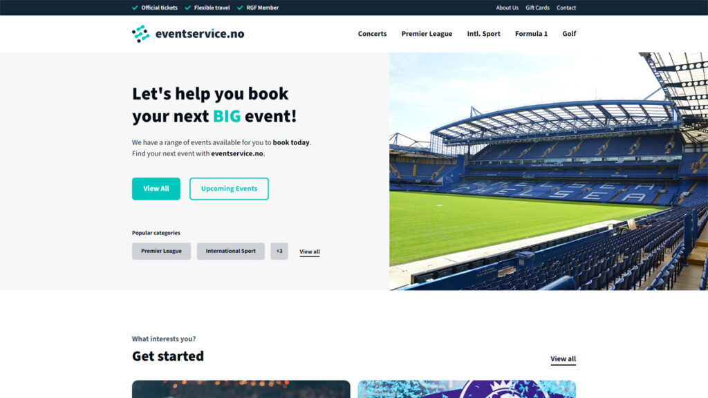
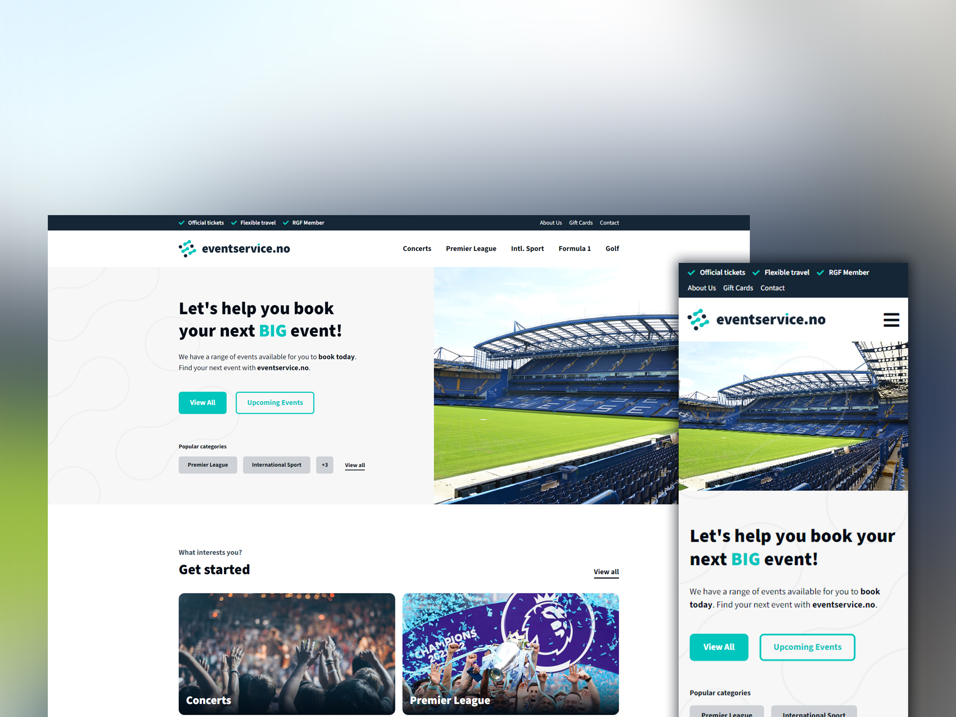
Once the logo was accepted, this made designing the website a breeze.
With such a versatile font, it allowed us to use its many weights across a variety of contexts. From titles on content cards, to links in menus, and more.
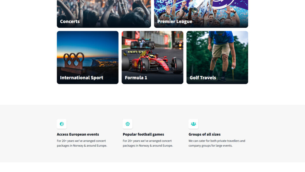
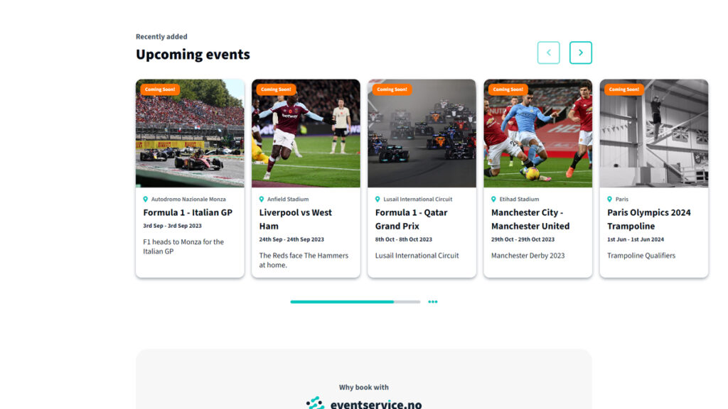
They planned to offer much more than just football and concert events. Therefore, we needed to build them an organisational system to help their users navigate the site to find the events they were after.
Looking for an event in the Premier League? Navigate to the Premier League page. Are you only after events that feature your team? No problem. Jump to individual team pages that display events featuring your team. Simple navigation was at the core of this website.
To complete the build, we integrated our Travelflow Contracts Events plugin directly into the website allowing for a seamless navigation-to-booking experience for the events you want. Users can book the events you set up within your Travelflow Contracts product directly on your website without any handoff to some 3rd party service that would do the heavy lifting for you.
The Result
What resulted was a logo and website that was leaps and bounds beyond what had come before – you’d almost think they were two different companies.
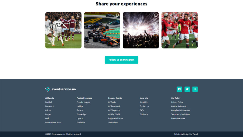
Simple navigation was at the forefront of this website. From the minute you arrive on the site, you’re presented with multiple options to help website visitors find their next big event. View the complete catalogue or browse the types of events on offer. The choice is yours.
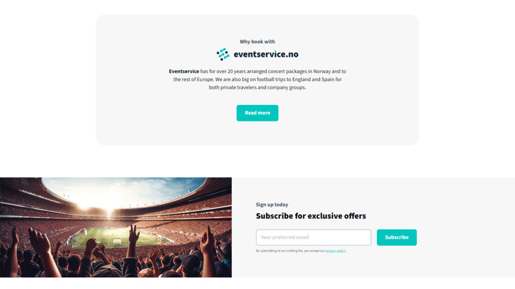
Large photo cards help reinforce the visual aspect of this brand showcasing the part of events you really care about, while pops of colour adorn the website UI on elements such as buttons and labels. All balanced within a clean content layout making the website super pleasing to the eye.
Eventservice were really pleased with their rebrand. This was a project we are really proud of, and we were super pleased assist them in the next stage of their business evolution. We look forward to seeing where Eventservice go from here and wish them lots of future success following the completion of their rebrand.
Check out Eventservice for yourself and let us know what you think.
Take a look at them now