Albrek Travel & Tours
The Brief
Projects we’re more than happy to take on are ones that I’m affectionately coining “a double whammy”.
What this means I hear you ask? Well, being the web design division of a parent company, Billian IT Solutions, means we can not only offer bespoke web design solutions. We can offer intuitive travel booking software designed to plug directly into the websites we create.
(It’s quite the business strategy really)
And it was such the case for our latest client, Albrek Travel & Tours.
Having reached out to us looking to replace their booking software, they had asked us to help with the integration process, as their previous website had been built and delivered by a previous company. Not a problem for us. However, we felt we could be of more assistance to Albrek. Offering both hosting of, and creation of a new website.
They were more than happy to proceed. “A double whammy”.
The Solution
Having already had an existing website created, they’d gone through the process of giving their requirements for what colours they like, what images to use, how would they like the website to function and the rest of it.
Albrek were after a simple solution to get their website up and running quickly so they can get their online visitors booking again. A redesign was certainly in order.
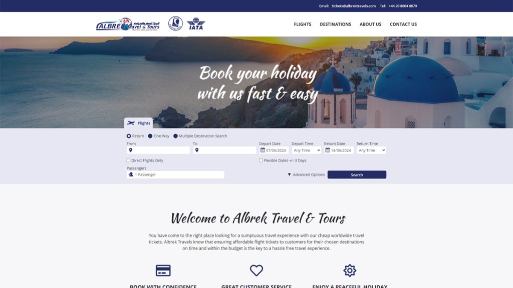
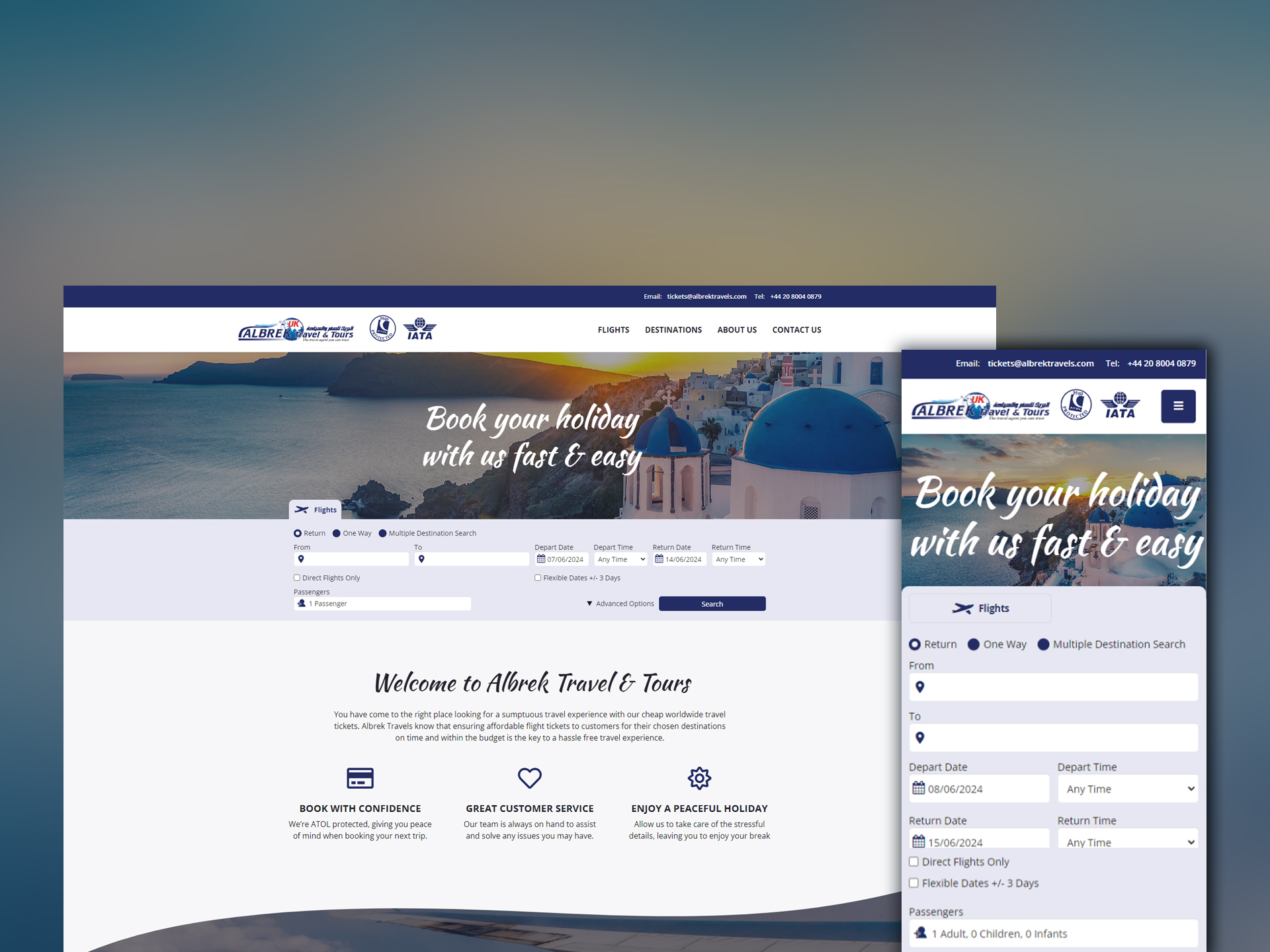
A design existed, it just needed refining. We created a more brand-focussed colour scheme replacing (questionable) uses of pink and replacing with a more brand recognisable dark blue. Complimentary colours followed, bringing together both text and graphical elements on the page to make a more cohesive palette.
Typography styles had also been experimented with, but they lacked consistency. We opted to reduce the number of typefaces used and create more defined text styles, to make more purposeful text elements on the page. It doesn’t sound like much, but less is more when creating an impactful theme.
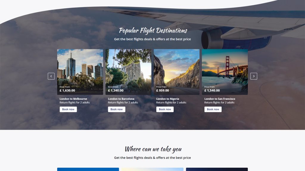
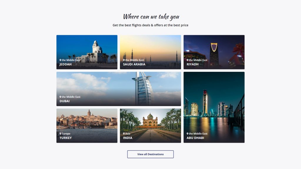
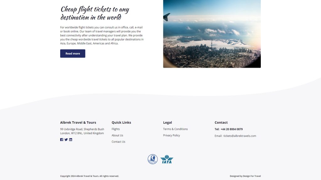
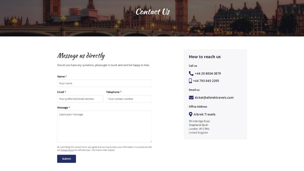
In addition to creating a refined theme, we worked on creating a more structured content layout. Breaking up content into digestible sections. We included redesigned special offer cards to help promote special fares sold by Albrek Travel. And for good measure, we included a ‘destinations’ post type, to allow Albrek to present content on each of the destinations they serviced – replacing a simple text-based list that lacked any functionality.
The Result
For a website that was meant as a simple redesign, turned out really well. Sometimes even the simple websites can leave an impression.
A clear evolution from what came before yet leaps ahead. A website designed to aid them in selling flights and promoting their latest offers. All bundled together with a WordPress CMS that makes content management quick and simple.
Just what they needed. And both Albrek and ourselves couldn’t be happier with the turnaround.
Check out Albrek Travel for yourself and let us know what you think.
Take a look at them now
